I was reading some of the comments and happen to agree, for the most part, with this guy.
R. Timm Says: February 20th, 2009 at 12:11 pm
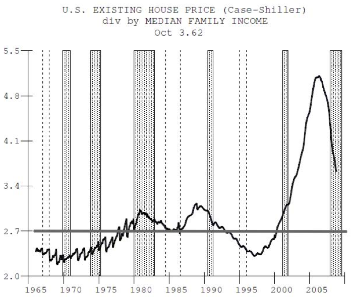
I think it is a gross oversimplification to look at some magic multiple of income to predict a housing bottom. Does anyone here think houses today are anything like the 1950s? People have made a conscious decision to put a greater percentage of income towards housing, hence mcmansions and gernally much greater sq ft./person. Also not all workers are going to be homeowners so median income is the improper metric. With approx 1/3 of the population as non homeowners mostly from the bottom of the income scale the proper metric would be to take the 3rd quintile or so.
Should I always spend 2% of income on a stereo system, or 0.3% on my TV? Should the value of my car equal 12.5% of annual income?
People’s tastes and priorities change over the decades. Not to mention tax rates, tax treatment of mortgage interest, interest rates, etc.
Can I borrow your towel? My car just hit a water buffalo.
Doc's chart depends on how the data is considered. Look at the title of the chart: "Consumer Loans At All Commercial Banks." What does that refer to? Loans being made or loans being held on the books. My guess is that it is loans being held on the books.
Look at how the graph line spikes up in the mid-2000's, then quickly goes back down. During the housing bubble, the banks would securitize the loans on their books then create entities to legally own the securities. They called them all kinds of fun names like Special Investment Vehicles and what not. So the loans were off the banks books because they were technically owned by this other entity.
So who owned that other entity? Voila! No body! Nice trick, eh? In 2007, however, changes in accounting rules went into effect (the banks had agreed to them) and a lot of the banks had to take those stinky loans back on their books. Citi were real into this game, spinning off securities to legal entities that were technically independent of Citi, but which eventually had to be recognized as owned by Citi.
Notice how right around that time in the series is when the amount of loans with the commercial banks starts going back up. If I'm right, all that graph represents is an accounting trick under-representing loans at the time they were made and now recognizing them at the time those loans are going bad.